| COLOR MATCHING
MIXING COLORS
There are two possibilities for mixing colors:
1) Mixing using the Color Charts, formula colors and a precision scale.
2) Mixing manually (by eye) the different primary tinting colors to obtain the desired result. In either case, shake or stir the containers very well before use.
MIXING WITH FORMULA COLORS:
Mixing with form formulas is the easiest method, since lack of experience in mixing manually can mean wasting dyes before getting the right color. With formulas you can obtain the desired color with minimal waste.
Simply locate the formula number of the color on the Color Chart or the Color Picker, then locate the formula number.
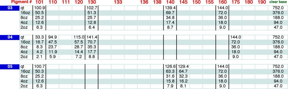
These are accumulative weights, DO NOT reset scale.
To make 8 ounces of color# 03:
a) Place an empty, container on the scale and turn it on. Be sure the screen shows 0.0 gr.
b) Add (101) White pigment till the scale reads 25.2 grams.
c) Add (130) Red pigment till the scale reads 25.7 grams.
d) Add (140) Dark Brown pigment to 34.8 grams,
e) Add (160) Yellow Oxide pigment to 36.0 grams.
f) Add Clear Base to 188.0 grams.
g) Mix thouroghly.
The final product to add is CLEAR BASE, of which there are several kinds. Choose according to the material gloss to be colored.
CLEAR BASE: Considered universal due to its suitability for all materials (leather, plastic, vinyl, etc.).
Available in (2000H) High Gloss, (2000) Satin and (2000M) Matte finishes.
PLASTIC PRIMER: (PC) Specially designed for plastics only.
CARPET DYE BASE: (CD) Specially designed for carpets. With or without metallic flake.
FURNITURE DYE BASE: (FB) Specially designed for furniture. Very flexible base.
After adding CLEAR BASE, mix well.
Check the color match (spray a small amount and dry) and see if any adjustments are needed. If so, using the same colors previously used in the formula. Add a few drops at a time to the bottle and always mix well. The advice in the “Mixing by Eye” part will be helpful.
Remember that the color will darken slightly when dried, so dry a color sample beforehand to check the color match.
MIXING BY EYE:
This method requires more practice. Although the process is simple, it is much slower if you lack experience.
However, the more you mix the formula colors, the more knowledge and experience you will gain in mixing colors by eye.
Remember when mixing with pigments (you may want to add a few drops of Clear Base when mixing your pigment to dilute the concentration of the pigment for mixing purposes only) (do not add to much or you will lighten your color and have a hard time matching your color).
Once you have achieved your color, you must mix with Clear Water Base (there is no adhesion qualities in pigments – the Clear Base in the adhesion base), the recommended proportion is 1 part pigment to 5 parts Clear Water Base. However, you can adjust the degree of pigmentation by varying the proportion of Clear Water Base you add to the mixture. After adding the Clear Base the color will lighten and then dry back to its original color.
COLOR TERMINOLOGY:
Saturation: The closer a color is to its purest form, the more saturated it is.
Value: The lightness or darkness color.
Hue: The purest form of a color; such as red, blue, green. With no added black, gray, white, or the color's complement.
Tint: A color with the presence of white. Lighter shade of a color. Pink is a tint of red.
Shade: A color with the presence of black. Darker shade of a color. Navy is a shade of blue.
Tone: Color plus Gray.
Primary Colors: Colors such as red, yellow, and blue. that cannot be mixed using other colors.
Secondary Colors: Two primary colors mixed together to make orange, green or purple. The brightest, most vivid green comes from mixing blue and yellow; most vivid purple from magenta and blue; most vivid orange from red and yellow. Using both sets of primaries in mixing offers the widest range of colors.
Intermediary Colors: Sometimes called tertiary colors, these are colors formed by mixing a primary with the secondary of that primary and another primary. In other words, if you mix blue with green, you get blue green, an intermediary color.
Neutrals: Colors which technically aren't colors, such as white, black, and gray, are called neutrals. Other colors may also be considered neutrals, such as various brown.
Aggressive (warm) Colors: Reds, Yellows and Oranges.
(cool) Colors: Blues, Greens and Violets.
Key Color: Dominant Color in mixture: Intensity or Chroma: The brightness or dullness of color.
COLOR DESCRIPTION:
Primary Colors:
RED: Will lighten very dark colors while also changing HUE.
Adding: Blue makes Purple
Adding: Yellow makes Orange
Adding: White makes Pink
Adding: Black or Brown makes Maroon
To remove Red from color use the opposite color on the Color Wheel - Green
BLUE: Will darken light colors while also changing HUE.
Adding: Yellow makes Green
Adding: Red makes Purple
To remove Blue from color use the opposite color on the Color Wheel - Orange
YELLOW: Will lighten dark colors while also changing HUE.
Adding: Blue makes Green
Adding: Red makes Orange
To remove Yellow from color use the opposite color on the Color Wheel - Purple
Secondary Colors/Opposite Colors:
Orange: 50% Red - 50% Yellow
Will lighten dark colors. Will also change tone to Red/Orange side.
Very powerful color, takes very little to change HUE.
Green: 50% Blue - 50% Yellow
Will darken light colors. Will also change HUE to Green side.
Purple: 75% Red - 25% Blue
Will darken light colors. Will change HUE to Red side.
Tone/Tint/Shade Colors:
Black: Will darken any color. May also kill the brightness of a color.
White: Will lighten any color. May also create milky look to the color. Does not drastically change brightness of color in most cases.
Brown: 33% Black - 33% Red - 33% Yellow
Will darken most colors. Will also change HUE to Red/Orange side.
Grey: Mixture: 50% Black, 50% White.
Shade of Grey will be governed by percentage of Black/White used.
More White = Lighter Grey. Less White = Darker Grey.
Will change Brightness of color.
Will also be used to change Brightness of color without changing Value.
Color should always be described in the following manner, “the original panel is (lighter, darker, redder, greener etc.) compared to the paint sample.” Cleanliness of the panel, grayer (dirtier or muddy), brighter (cleaner appearance), must also be considered. Viewing the panel at several angles, the front, side and the top, is also must.
Spray a small color sample on the prepared surface and allowing sufficient dry time, look at the original finish and compare it with the color. When you answer the question “the car’s original finishing is (lighter, darker, redder, greener, has more blue, has more yellow etc.), it tells you what is needed to correct the difference in the color.
IMPORTANT TIPS
1. Adjust for value (lightness or darkness) of color first. Adjust for hue (color) after adjusting for value.
2. Air pressure affects color matching. The higher the air pressure (drier coat), the lighter the color. Similarly, the lower the air pressure (wetter coat), the darker the color will be.
3. Use extreme caution when tinting light colors. Just a few drops will usually be sufficient.
4. To lighten a color, use white or the lightest color in that formula. For those colors that require metallic, use silver metallic. If color contains BOTH white and metallic, tint first with metallic, then determine if white is needed to lighten.
5. Before tinting a color, always allow the finish to dry, as most colors dry darker and have a slightly different cast.
NOTE: The TRUE color is only developed by spraying (atomization); dipping or smearing will give a inaccurate color.
6. Try always to tint with daylight conditions. Artificial light (fluorescent/incandescent) will not be as accurate to duplicate the color.
7. Always clean adjacent panels thoroughly, and color match to a clean panel.
COLORING MIXING GUIDE
GREY
Starting Base: White - Black - Brown - Orange - Yellow - Beige
Percentages will be determined by color to which you are matching. Not all colors may be needed.
To Darken Add:
Black: Kills Brightness of Yellow/Orange tone while darkening.
Brown: Darkens while retaining Orange tone.
To Lighten Add:
White: Lightens, does not change tone.
Beige: Lightens Dark Grey while retaining Yellow tone.
Tone: Orange, Yellow.
Compensating: If color is: Too orange: Add small all amount of Blue. Add small amount of
White to compensate darkening effect.
Too Yellow: Add small amount of Purple. Add small amount of White to compensate darkening effect.
Notes: Do not forget the killing effect that black has on the Brightness of a color. Sometimes just adding Black and White (Grey) will dull the Orange/Yellow tone.
If Grey has a Greenish or Bluish tone, add a small amount of Green or Blue to the dye.
TAN
Starting Base: Beige - White - Brown - Yellow - Orange
Percentages will be determined by color to which you are making.
To Darken Add:
Brown: Darkens while retaining Orange tone.
Black: Darkens but kills brightness of Yellow/Orange tone.
Beige: Darkens very light colors. Retains Yellow tone.
To Lighten Add:
White: Lightens all colors. Does not dramatically effect Brightness.
Beige: Lightens darker colors. Retains Yellow tone.
Tone: Yellow - Orange.
Compensating: If color is: Too Orange: Add small amount of Blue. Add small amount of White to compensate darkening effect.
Too Yellow: Add small all am amount of Purple. Add small amount of White to compensate darkening effect.
Notes: Do not forget the killing effect that black has on the Brightness of a color. Sometimes just adding Black and White (Grey) will dull the Orange/Yellow tone.
Tans are predominantly White with Yellow/Orange tones. Shading will most often be done using Brown.
BEIGE
Starting Base: Beige - Brown - Yellow - Orange - Red
Percentages will be determined by color to which you are matching.
To Darken Add:
Brown: Darkens while retaining Orange tone.
Black: Darkens but kills Brightness of Yellow/Orange tone.
Beige: Darkens very light colors. Retains Yellow tone.
To Lighten Add:
White: Lightens all colors. Does not dramatically effect Brightness.
Beige: Lightens darker colors. Retains Yellow tone.
Tone: Yellow - Orange
Compensating: If color is: Too Orange: Add small amount of Blue. Add small amount of White to compensate darkening effect.
Too Yellow: Add small amount of Purple. Add small amount of White to compensate darkening effect.
Notes: Do not forget the killing effect that black has on the Brightness of a color. Sometimes just adding Black and White (Grey) will dull the Orange/Yellow tone.
Beige is predominantly White with Brown/Orange tones. Shading will most often be done using Brown.
Toning will most often be done using Orange, Red or Purple.
DARK BROWN
Starting Base: Brown - Black - Orange - Red - Yellow
Percentages will be determined by color to which you are matching.
To Darken Add:
Brown: Darkens while retaining Orange tone.
Black: Darkens but kills Brightness of Yellow/Orange tone.
To Lighten Add:
White: Lightens all colors. Will create a Milky effect in larger percentages.
Beige: Lightens darker colors. Retains Yellow tone.
Tone: Yellow - Orange - Red
Compensating: If color is: Too Orange: Add small all am amount of Blue. Add small am all amount of White to compensate darkening effect.
Too Yellow: Add small all am amount of Purple. Add small am all amount of White to compensate darkening effect.
Too Red: Add small all am amount of Green. Add small am all amount of White to compensate darkening effect.
Notes: Do not forget the killing effect that black has on the Brightness of a color. Sometime times just adding Black and White (Grey) will dull the Orange/Yellow tone.
Dark Brown is predominantly Brown with Red/Orange tones. Shading will most of soften be done using Orange, Red or Purple.
A Milky finish will be created using larger am amounts of White and compensating the lightening effect with Black or Brown.
BLUE (with Green tone)
Starting Base: Blue - Black - Green - White - Beige - Yellow
Percentages will be determined by color to which you are matching.
To Darken Add:
Black: Darkens but kills Brightness of Blue tone.
Brown: Darkens while dulling Blue tone.
To Lighten Add:
White: Lightens all colors. Will create a Milky effect in larger percentages.
Beige: Lightens darker colors. Dulls Blue tone.
Tone: Blue - Yellow - Green - Brown
Compensating: If color is: Too Blue: Add small amount of Orange. Green may also be added to make a Green/Blue effect.
Too Yellow: Add small amount of Purple. Add small amount of White to compensate darkening effect.
Too Green: Add small amount of Red. Add small amount of Black to compensate lightening effect.
Notes: Do not forget the killing effect that black has on the Brightness of a color. Sometimes just adding Black and White (Grey) will dull the Blue/Green tone.
Blue/Green is predominantly Blue with Green tones. Shading will most often be done using Black.
Toning will most often be done using Yellow, Green or Blue. A Milky finish will be created using
larger amounts of White and compensating the lightening effect with Black or Brown.
BLUE (with Purple tone)
Starting Base: Blue - Black - Purple - Red - White - Beige
Percentages will be determined by color to which you are matching.
To Darken Add:
Black: Darkens but kills Brightness of Blue tone.
Brown: Darkens while dulling Blue tone.
To Lighten Add:
White: Lightens all colors. Will create a Milky effect in larger percentages.
Beige: Lightens darker colors. Dulls Blue tone.
Tone: Blue - Purple - Red - Brown - Beige
Compensating: If color is: Too Blue: Add small amount of Orange. Add small amount of Black to compensate lightening effect. Green may also be added to make a Green/Blue effect.
Too Red: Add small amount of Green. Add small amount of White to compensate darkening effect.
Too Green: Add small amount of Red. Compensate lightening effect with small amount Black.
Notes: Do not forget the killing effect that black has on the Brightness of a color. Sometimes just adding Black and White (Grey) will dull the Blue/Green tone.
Purple is predominantly Blue with Red tones. Shading will most often be done using Black.
Toning will most often be done using Magenta, Red or Blue. Requires more Red or Maroon to start base. Purple effect will intensify with larger quantities of Red or Maroon.
A Milky finish will be created using larger am amounts of White and compensating the lightening effect with Black or Brown.
RED
Starting Base: Red - Yellow - White - Orange - Blue - Brown - Beige
Percentages will be determined by color to which you are matching.
To Darken Add:
Blue: Darkens while retaining Red tone, will create Purple effect.
Brown: Darkens while dulling Red tone.
Black: Darkens but kills Brightness of Red tone, turns color Brown.
To Lighten Add:
Red: Will lighten if very dark, will intensify Red tone.
Yellow: Lightens while causing an Orange/Yellow tone.
Orange: Lightens while causing an Orange/Red tone.
White: Lightens all colors. Will create a milky or pink effect in larger percentages.
Beige: Lightens darker colors. Dulls Red tone.
Tone: Yellow - Orange - Maroon - Blue - Brown
Compensating: If color is: Too Blue: Add small amount of Orange. Add small amount of White or Beige to compensate darkening effect. Red may also be added to compensate for the loss of tone.
Too Yellow: Add small am all amount of Purple. Usually shade does not require adjusting at this point.
Too Orange/Brown: Add small amount of Yellow. Blue may be added if way off, but compensate darkening effect with small amount of White or Beige.
Notes: Do not forget the killing effect that black has on the Brightness of a color. Adding Black will create a Brownish appearance. Sometimes just adding Black and White (Grey) will dull the Red tone.
Red is predominantly Red with Yellow/Orange tones. Shading will most often be done using Blue.
Toning will most often be done using Yellow, Orange or Blue. A pinish finish will be created using larger amounts of White.
PURPLE/MAROON
Starting Base: Maroon/Purple - Blue - Red
Percentages will be determined by color to which you are matching.
To Darken Add:
Blue: Darkens while retaining Red tone, will create Purple effect.
Brown: Darkens while dulling Red tone.
Black: Darkens but kills Brightness of Red tone, turns color Brown.
To Lighten Add:
Red: Will lighten if ill very dark, will intensify Red/Orange tone.
Yellow: Lightens while causing an Orange/Yellow tone.
Orange: Lightens while causing an Orange/Red tone.
White: Lightens all colors. Will create a Milky effect in larger percentages.
Beige: Lightens darker colors. Dulls Red tone.
Tone: Maroon - Blue - Red - Yellow - Orange
Compensating: If color is: Too Blue: Add small all amount of Orange. Add small amount of Black to compensate lightening effect.
Too Yellow: Add small amount of Purple. Usually shade does not require adjusting at this point.
Too Orange/Brown: Add small amount of Purple or Red. Blue may be added if way off, but compensate darkening effect with small am all amount of White, Yellow or Beige.
Notes: Do not forget the killing effect that black has on the Brightness of a color. Adding Black will create a Brownish appearance. Sometimes just adding Black and White (Grey) will dull the Red tone. Maroon is predominantly Maroon with Red/Blue tones. Shading will most often be done using Blue.
Toning will most often be done using Maroon, Red or Blue. Maroon dye always intensifies Deepness of color. When correcting for small amounts of Yellow or Orange always add more Maroon dye to compensate for loss of Brightness.
A Milky finish will be created using larger amounts of White, which is many occasions desirable, and compensating the lightening effect with Maroon and Blue.
GREEN
Starting Base: Green - Yellow - Blue - White - Beige
Percentages will be determined by color to which you are matching.
To Darken Add:
Brown: Darkens but kills Brightness of Green tone, creates Brown tone.
Black: Darkens but kills Brightness of Green tone.
Blue: Darkens and intensifies Blue/Green tone.
To Lighten Add:
White: Lightens all colors. Will create a Milky appearance.
Yellow: Lightens while causing an Orange/Green tone.
Beige: Lightens darker colors. Retains Yellow/Green tone. Kills Brightness.
Tone: Blue - Yellow
Compensating: If color is: Too Green: Add small amount of Red. Add small am all amount of Black to compensate lightening effect. Yellow may also be added to intensify Green/Yellow tone.
Too Yellow: Add small all am amount of Purple. Add small am all amount of White to compensate darkening effect.
Too Blue: Add small all amount of Orange. Green may be added but color will become Brighter.
Notes: Do not forget the killing effect that black has on the Brightness of a color. Adding Black will create a Brownish appearance. Sometimes just adding Black and White (Grey) will dull the Green/Yellow tone.
Green is predominantly Green with Yellow/Blue tones. Shading will most often be done using Black. Black and White (Grey) will be extensively used when making Green color matches.
ADDING ADDITIVES
Additives are available for adjusting the final finish.
WATER BASE
(35) Flat-Ayd : Shake vigorously before adding 5-30% to the color mixture to dull down the shine.
(38) Dulling Agent : Shake vigorously before adding 5-20% to the color mixture to dull down the shine.
(95FA) Flex Additive/primer: Add 5-20% to the color mixture to add flexibility to areas experiencing heavy use/wear. Also used a straight primer before color is applied.
(SLIP) Slip Additive: Lightly shake before adding 2-10% to the color mixture to soften the feel of the new surface.
(2000M) Matte No-gloss clear: Lightly shake before top coating over the original color to dull the sheen.
(2000H) Hi-Gloss clear: Top coat over the original color for a high gloss sheen.
(2000HW) Hi-Wear clear: Spray over repaired area as a final coat for extra chemical resistance, UV protection and durability.
(SL-7) Crosslinker: Add 1-3% to the color mixture for chemical resistance and to strengthen the adhesion of the color to any surface.
APPLYING COLOR:
Before color application, protect all areas that you do not want to color. Remember that small dye particles can be all shifted by air to undesirable spots, so spare no effort in protecting areas outside the area to be colored.
Use any of the various sizes of Masking Tape to cover these areas. Include drop cloths and plastic sheets for covering entire areas with just a single strip of Masking Tape. Remember to protect the corners.
IMPORTANT: Always strain the dye at least once with a fine strainer before filling the tool you will be using to apply it.
Always spray thin coats, dry to touch before spraying another coat.
One of the advantages of Water Base Colors is that after finishing the coloring process, the color will blend evenly without having to color a large area.
Note:
1) If the Water Base Color dries too quickly, add a little water to slow drying.
2) When color application is finished, check the smoothness of the part. If it is a bit rough, sand with 1000 grit. Also check the air pressure (turn down) and increase fluid adjustment.
PROTECTIVE COATS
Process for Water Base Colors
For protection from sunlight and abrasive cleaners, use the (2000HW) Hi-Wear Topcoat Clear with (SL-7) crosslinker.
Simply add a little of the color previously used for the repair and the required additives pair for the part you are working on and then apply in fine coats.
Available in HIGH GLOSS (2000H), SATIN (2000HW) & MATTE (2000HWM) finishes.
|

